I saw this gorgeous house online and wanted to share some of the eye candy that makes up the interiors of this home.
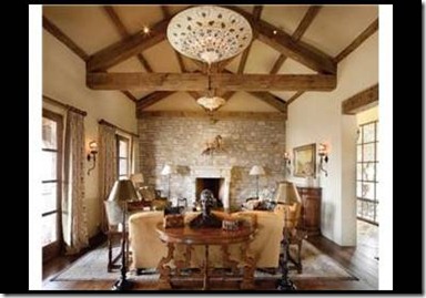
Beams appear throughout in a few of the rooms. Check out that ceiling light fixture!
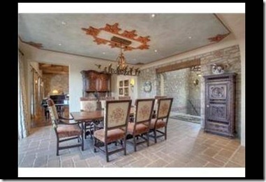
Interesting detail on the ceiling where the light fixture sits in this dining room picture.
Love the beams again. This portion of the kitchen looks like it opens right up to the dining room. It looks like the refrigerator is enclosed in cabinetry {to the right next to the ovens}.
This looks like a view of the kitchen from the dining room. What a great decorative element above the stove!
More beams. I labeled this a “library” when I saved the picture, but it looks like it is more of a home office. Love the desk and the built-ins!
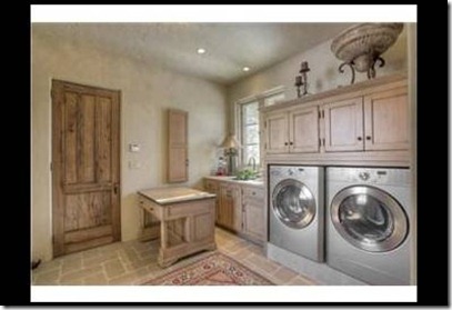
Huge laundry room! What a great space and there is enough room and surfaces to do more than just laundry here.
I think you can really appreciate the expanse of stone in this house by looking at this stairway. I like that is ironwork and not wood used on the railing.
What a great porch for both entertaining and just relaxing on.
I’m going to guess that this is a wine room. Love those doors!
Great window and chandelier {from what I can see}. I like that it is not overwhelmed with furniture in here.
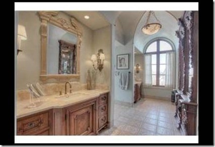
Love the size of this bathroom, although it looks like there’s a lot going on with the detailing on the pieces.
Another bedroom. No beams this time!
I noticed that there is not too much in the way of pictures or wall décor of any kind {there are a few but not as much as you might expect with the expanse of wall in this house}. The accessories are also very minimal. I’m guessing they had it staged before listing, although they could just be minimalists!
*Picture source yahoo real estate
Kathy


That is unbelievable. I love the kitchen and the ceilings.
ReplyDeleteWhat a huge house! I would say it was definitely staged before it went on the market and it's lovely! (I can hear my Realtor in my ear saying DEPERSONALIZE PLEASE!)...LOL
ReplyDeleteLove,
LuLu~*xoxo
Looks like it's worth every penny. Really fabulous!
ReplyDeleteJeanine
Did you notice the warm, rosy color scheme that flowed from room to room. It made it very cozy in spite of all the stone and wood. Now...if I had that kind of money...
ReplyDeleteXO,
Jane
It looks like a village! I would be more than happy just to live in the sunroom...beautiful!
ReplyDeleteJoyce~
Just gorgeous! :)
ReplyDeleteHmmm...I'm not too sure about the homeowners being minimilists! LOL! What a stunning home. So many unique and charming details. Thanks for sharing it all with us, Kathy!
ReplyDeleteThat is one awesome place...the stone, I love it but I wonder what it would be like to live in it everyday. Since I ain't got 3.9 mill I guess I'll never know!lol:)
ReplyDeleteOOOHH!!! I LOVE the laundry room..I do believe I could finally be happy to do laundry... : )
ReplyDeleteThanks for the tour, Kathy! What a place! Reminds me of a Tuscan Villa! Have a fabulous weekend!
ReplyDeleteBest Wishes and Blessings,
Amanda