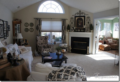
When we moved last Fall from New York to Ohio, I brought all my pictures and wall décor. It didn’t take long for me to realize that with an open floor plan, that meant less walls, which meant a lot of my pictures weren’t going to get used. So, they wound up in the attic and under the guest room bed. Like this one.
I forgot I even had this picture! I found it when I was looking for an under-bed shoe bin. This frame was originally a white crackle with gold underneath {when I bought it}. I then painted it black a few years ago.
If I had more wall space in the living room, I could use it in here. My next option is this space above the bookcases in the sunroom.
Very high, cathedral ceilings that just call out for something. While I had the Coco and Old Ochre out to do the little accent table for in here, I decided to makeover this frame, yet again.
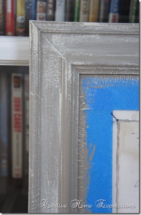
As I mentioned in my post about the table, I wasn’t crazy about the Coco {at least for these projects} so I wound up dry brushing the Old Ochre over the frame. The pictures above and below are pre-wax.
I did clear then dark wax. I was just going to do clear wax, but thought the dark wax might help give it a more aged look.
I kept the dark wax to a minimum, but did put a bit extra in some spots to give a more aged appearance.
I attached some felt pads to the back {we’ve got tons since we put in the wood floors}, sat it on top of the bookcases and leaned it against the wall.
The black would have been too harsh in here with the color scheme, so painting the frame changed it up just right for me. I did notice afterward that the paint color wound up picking up on the color in bulb portion of the botanical, as well as the color of the background script and little flowers in the mat area.


31 comments:
Kathy....It looks wonderful with the "new" frame. I love the print and don't see how you could have forgotten all about it. Isn't it fun shopping under the bed and in the attic?
As soon as you put the dark wax on, it just popped!!! Love the new look, isn't it fun to redo something, then redo it again ... to your hearts content :) Hugs ~ Mary
You have been busy!!! Looking very good! Love the ceiling fan choices.
I've tried to email you and had the wrong email address...to let you know that the hat arrived and that I posted about it...guess you figured it out before I did!!
Deb :)
I like your newest makeover on the frame, and I think you've found a great place for it. I have lots of things I forgot I had. It's like shopping in your own house.
That is a great spot to display your print. The frame looks great in it's new color.
LOVE the color!! The spot over the bookcases is perfect.
Oh I love botanicals and with the new frame it looks so pretty!!!
You have recrated yet another awesome piece with paint.
You sure do have a talented eye, Kathy!!
This is just beautiful. Chanding the frame made a world of difference. I also love the print.
Cynthia
I love the new color. It looks great. It's always fun to find something you forgot that you had.
the new way you did the frame made an already beautiful piece of art even better.
Your frame looks great! I really should expand my horizons and paint my frames something besides white with a glaze.
Love the color change and where you have it displayed. Very pretty.
Jeanine
I love botanicals and you updated the frame beautifully! Great transformation!
The frame turned out great Kathy and it looks so pretty on top of your bookcases. You found the perfect spot for it. Your living room is gorgeous!! Stay cool and enjoy your evening, Gail
Liked it before ..love it now..great change
so nice to come across a past treasure....love what you did with the frame...beautiful Kathy!
You did an amazing job with this frame! It is my newest decorating go-to; paint it with ASCP! And, it looks great in its new home!
You did a fabulous job on this frame. Love the way it works with your image! Your project would be perfect to share at TUTORIALS TIPS AND TIDBITS, my new weekly linky party! It is live every Wednesday evening at 8:00. Come on over and join in!
Looks great with the new version of the frame! ASCP looks good on everything.
Great job with the frame. Isn't it fun to find something that you used to have and then rework it for a new setting? LOVE it- xo Diana
Love how the frame turned out, Such a beautiful finish!
Love it! Don't you just love transforming something that you already have without spending a penny. Your home looks wonderful by the way.
I love it with the lighter colors. I noticed immediately that the new frame color accented the color in the botanical nicely. I just love botanicals. This turned out beautiful and you are right, the touch of dark wax was the finishing touch.
Kathy,
Your frame makeover looks really good, and I am glad you found it, too pretty to be under a bed.
Blessings,
Linda
first, your living is gorgeous! and the softer frame finish is lovely--great job!
That color goes much better with the art. It even brings out the color of the bulb. The black was too harsh.
I like this new color better and I think you're right - the black would've been too dark. Old Ochre is one of my fave ASCP colors! Haven't tried the CoCo yet.
It looks terrific and I like leaning art. I rotate my art in the yellow house. I also buy and sell some pieces and sometimes I try them out.
Well Kathy! So glad to meet you! Thanks so much for swinging by, and I love your blog. Wow, the photos of your work are great. Riki
Oh sweets....you rocked out that frame. Totally LOVE IT! I use to wish I had two house so I could decorate them opposite of each other. But then I thought...NO REBECCA...you'd have two to clean.
In my dreams my 2nd house would look like yours. LOVE IT!
xoRebecca
Post a Comment