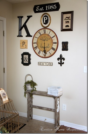
I finished the gallery wall in my entry/foyer! I’m really liking it and there is room for me to add some additional small pieces if I’d like. I was able to use two of the things that I already had and showed you here ~ the clock and the “K” initial. Everything else I purchased came to a total of approximately $70.00, so I was able to make a change here for a minimal amount of money.
Just as a reminder, this is what I had “before”. My problem with this area is that it is a small entry/foyer area, but the wall behind the door seemed like such a large expanse. The three pictures I had hung here in the interim were not doing anything for me. {That white thing on the floor is a portable air filter, which has since been moved}.
Here is what I managed to come up with.
The items that I did buy I purchased on sale or with a coupon to keep the costs down, or very reasonably priced pieces I found on Etsy.
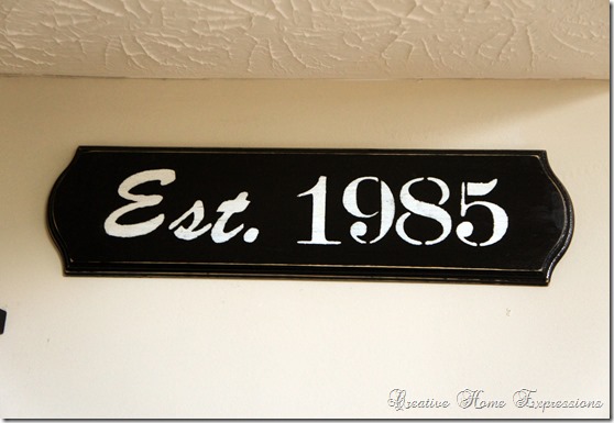
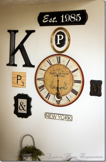
Starting at the top, I made the “Est. 1985” sign from an unfinished wood sign purchased from Michael’s. With a coupon, it cost me $4.69. I had the paint and stencils to complete it. I posted about that project here.
As I mentioned, I already had the clock and the “K”. I purchased an “M”, “P”, and “&” from Hobby Lobby. The “&” was too heavy, fell off the frame and broke. Since I still wanted one, I went with a vinyl and attached it to the glass of the frame. I put some Osnaberg fabric behind the glass.
I purchased two unfinished wood plaques at Michael’s, painted them black and distressed them, and attached the “M” and “P” to them. I painted the “P” Ivory to break up the dark colors a little. I had found the oval gold frame at the local antique mart and hung it around the “P”.
New and purchased from Etsy shops were the Scrabble tile “P” from 15tangerines. I also purchased the “New York” sign from Sideway Signs on Etsy. I found the vintage rabbit print on Pinterest, printed that out on some photo paper, and got a frame for it. The fleur de lis came from Hobby Lobby.
I picked up the table at the local antique mart and I showed you how I added a little French look to this rustic table here. I took some books that I would have donated, and painted and stamped them{here}.
I also added the Goodwill basket I made over into a French basket.
I’m really enjoying looking at this wall now! This is what I see now when I am sitting on the sofa in the living room in the morning, having my coffee and reading blogs.
I’m so much happier with how it looks now! Even when I have the door open I can still see a good portion of it.
Linking up with
Make It Pretty Monday at The Dedicated House
Wow Us Wednesday at Savvy Southern Style
Swing Into Spring at DIY by Design
Open House Party at No Minimalist Here
Treasure Hunt Thurs. at From My Front Porch To Yours
The Inspiration Gallery at Craftberry Bush
Be Inspired at Common Ground
Feathered Nest Friday at French Country Cottage


30 comments:
Good Morning Kathy! Your gallery wall looks wonderful and makes such an impact on the wall. You have created a very artful display with all of pieces. The little bench is perfect for that space too. Love it all!
Jane
Kathy, That looks really great- I think it defines the area, too, into a real entryway. Good choice of visual interest all the way around. Love the letters intermixed with everything. Perfect! xo Diana
Awesome job Kathy!! I love it!
Oh I love it. It really looks fabulous. You did a great job of adding different things so it is really interesting and pretty. I think you need to link it up this evening to the new Inspire Me party that is replacing Table Top Tuesday. Hope you'll join. Hugs, Marty
Kathy, I love your entryway all finished. The 'Established 1985' sign and the scrabble letter are my favorite parts. The whole thing together looks amazing like it should be in a magazine. I'm definitely pinning this one! Have a great day! ~ Jamie
Kathy, the galley wall is interesting and pretty. I love the mix you used. The bunny print is too sweet. xo, Olive
It looks fabulous! I love the New York touch too. =) Well done!!!!!
Jeanine
Hi Kathy,
Your gallery wall turned out great. I love the intermix of your letters with the other elements. Really makes a statement in the entry.
Beautiful job!
XO CM
You did a great job pulling all those pieces together. I love the way it turned out.
Great collection! I love all the letters - so glad you didn't give up when the & was too heavy. LOL!
I'm visiting you today from Make It Pretty Monday. I hope you get a chance to stop by my blog and leave a comment and Link Up, too!
~ Megin of VMG206
Spring Hello
It looks great, Kathy!
Love your gallery wall! Life to the full! Melissa @ DaisyMaeBelle
If there is room, I would move the books to the floor next to the bench..It would look a little wider..The wall looks great..Good job..
You did an awesome job with this wall! It looks great.
www.modernworld4.blogspot.com
Kathy - Your arrangement really makes a statement on that wall. Really nice job. Enjoy!
Judy
Great job! What a design statement. Letters and numbers are so hot now!
Carol
The gallery wall is so pretty Kathy!...you did a great job in collecting the perfect items for the wall...such a great coordination of beauty and function!...Well done!!! Love it!
Looks great. I love the bench!
Hi Kathy, your gallery wall turned out great!
You did an awesome job within the space you had to work with Kathy! I love gallery walls and this one is perfect!
xoxo,
Kim
Kathy, you did such a great job on the gallery wall, I love all the pieces. I really like that print with rabbits and the clock!
Cynthia
Kathy that looks ten times better! I love it! That big clock just makes a great focal point with all your other cool things around it!
Your gallery wall turned out great, Kathy! It fills up the large entry wall nicely.
Mary Alice
Hey, Kathy! I love gallery walls and yours turned out beautifully. I adore that sweet little bunny print!
Your gallery wall looks fabulous...I love the table too..we need something like that for our small entry...
What a great idea. Love what you did with everything. The little bench is great touch too!
Liz
Great job on your gallery wall! Those can be hard to do. Your composition looks great. I like all the extra details you put into it and I love the vintage rabbit print!
ME ENCANTA LO MINIMALISTA DE LA ENTRDA.
SALUDITOS
LOVE your gallery wall!! I would love for you to link up at SHOW-licious Craft Showcase.
Just follow the link....http://sew-licious.blogspot.com/2013/04/show-licious-craft-showcase-26.html.
Marti
You've made a small entry very dramatic and I just love it.
Post a Comment