Tuesday, April 30, 2013

Lantern Makeover & A Winner

I found this lantern at Goodwill about a month ago and finally got around to giving it a little attention.

2013 04 01_0923

I thought it would be a good candidate for a makeover to use on our little table outside our front door.  After stripping it of its Christmas finery and cutting off the faux rope, I decided to take the easy route and spray paint it. 

SONY DSC

Using what I had on hand, I grabbed a can of Heirloom White spray paint.  I cut some ads that were destined for the recycling can to fit over the glass inserts to protect them from paint. 

2013 04 27_1164

Here it is on our little outdoor table here at the condo, with a tea light ready to be lit.

SONY DSC

I think it’s the perfect size for this little table.  A nice refresh for not a lot of money!

SONY DSC

The winner of the giveaway for The Design Cookbook by Kelly Edwards {via random.org} is comment number 6 ~

Olive from Olive Out!

Congratulations, Olive!  I will be in contact to get your mailing information.


Monday, April 29, 2013

Little Decorative Bread Board Makeover

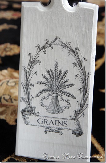
I found this little decorative bread board at Goodwill several months ago and finally had a chance to give it a makeover. 

2013 03 18_0718

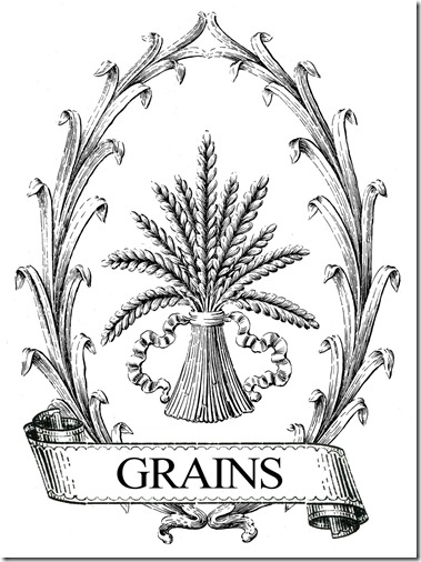
Using what I had, I painted it with a flat white paint.  I really thought it was going to take more than two coats to cover that decorative painting, but two coats seemed to do it.  I then used this image from The Graphics Fairy that I had all ready and waiting for a project.

Wheat-Grain-Sack-Vintage-GraphicsFairySm

I did the Mod Podge transfer technique to transfer it onto the board. 

SONY DSC

This is already in my booth waiting for a new home!

SONY DSC

Linking up with:

Brag Monday at The Graphics Fairy

Saturday, April 27, 2013

Vintage Supply Swap

The most recent swap I did was hosted by Elizabeth of Creative Breathing.  The swap was to create a Vintage Swap Supply Box using a box no bigger than a shoe box. Which is what I used ~ a shoe box that I luckily must have saved some months ago thinking it would come in handy. 

2013 04 10_0995

My partner was Michele of Nook and Cranny.  Michele is a very talented and creative crafty person, and I was hoping to give her a pretty vintage look box with some useful crafting supplies.  I started out by covering the box in some scrapbook paper I had.  A nice faded blue and cream polka dot for the bottom and a coordinating blue and cream paper for the lid.

2013 04 13_1016

I found a paper doll image on Pinterest, printed it out on cardstock, and glued that to the lid. 

SONY DSC

I made it a little more personal by using a small doily {received in another swap} and a Scrabble letter “M”.

SONY DSC

I filled it with a bunch of goodies!  Some I bought and some I already had.  I hope I gave Michele a good assortment to make some new projects!

SONY DSC

Here is the box I got from Michele.

2013 04 22_1105

2013 04 22_1107

Lots of goodies! 

2013 04 22_1110

Trims, lots of crafting supplies, buttons, a wonderful old book of Grimms Fairy Tales.

2013 04 22_1111

Game pieces, old cards, new cards with beautiful pictures taken in Vermont.

2013 04 22_1112

2013 04 22_1113

2013 04 22_1114

A really fun item that Michele included was this newspaper from 1929.  I think this will be an interesting read.

2013 04 22_1104

I must have sat for almost an hour going through everything!  I felt like a kid at Christmas.  Thank you so much, Michele! I love it all!


Friday, April 26, 2013

Keyed Up

I found these great Syroco keys at Goodwill recently and, while I love them for myself, I thought they’d be good additions to my booth. 

2013 04 22_1103

SONY DSC

I wasn’t sure if I was going to paint them or not since gold seems to be making its way back into home décor.  I am finding I have the same problem as other booth vendors ~ letting some of my finds go!  I decided to keep the smaller key and add it to my entry wall gallery, and I decided to leave the large key gold and see if it sells.  If not, I can always paint it. 

2013 04 22_1115

The smaller key got a brush of La Craie Wrought Iron paint, then wiped with a paper towel so it just hit the details.  This is the first time I am trying La Craie.  I purchased two sample colors from Shannon at Fox Hollow Cottage

2013 04 22_1116

The key can hang horizontally or vertically and to fit in with my wall I hung it vertically.

SONY DSC

You might also notice that I added the mirror with black and gold trim.  That was another Goodwill find and there were two.  Since I could only manage one in this area, the second went to my booth.

I’m having a giveaway for The Design Cookbook by Kelly Edwards here! Ends April 27th!  Lots of pictures and great decorating tips.

Wednesday, April 24, 2013

One, Two, Three ~ Quick Decorating

One and two, anyway!  I hung up the two oblong shaped silver trays I found over the past couple of months thrifting.  I need one more.  Rather than wait for that third tray, I just decided to get them up on the wall and out of the closet.  This is the wall in the kitchen where I put them.

SONY DSC

Just a little nothing of wall, but a good size for these trays.  Here they are up.  I should have kept the stepladder out for these pictures ~ the top tray looks like it is higher than the cabinet molding, but it’s not. I guess it’s because I’m pointing the camera up that it looks that way.

SONY DSC

The third tray {once I find it} will go on the bottom.   It took me all of 10 minutes to hang these.  I like the bit of sparkle it brings to the kitchen.

I have a giveaway going on for a copy of The Design Cookbook by Kelly Edwards here! It ends April 27, 2013.


Monday, April 22, 2013

The Design Cookbook ~ An Interview & A Giveaway

I have a nice treat for you today!  I had a chance to review The Design Cookbook by Kelly Edwards recently.  In The Design Cookbook, Kelly offers some beautiful photographs of interiors along with her tips, ideas and design philosophy.  Broken down by room and style, her rooms show a variety of ways to add color as well as different styles to your décor.  “Recipes” for creating a particular look are laid out as in a cookbook, with ingredients followed by the recipe.

“Recipes For 5 Minute Decorating” was a favorite for me, because sometimes that’s all we have time for before running out the door.  Kelly also has some DIY projects in the book for you to try in your own home. It’s a wonderful book for inspiration and to just enjoy some beautiful design. 

2013 04 11_0980

I recently had the opportunity to interview Kelly:

What was the inspiration for your book title The Design Cookbook? The concept for the book was actually my dads idea. I told him I was wanting to write a design book and he said, "Why don't you make one that looks like a cookbook?" I thought, " that's ingenious!" Truth is... people love to read cookbooks even if they can't cook. It's such a great approach to design. If you give someone a photo, a recipe and a list of ingredients it makes it so much easier to complete a room! I wanted to show people that with a recipe for a room, they can be their own designer.

2013 04 11_0982
Who would you say has been your design influences, both personally and professionally? Wow, I wish I had one. I have MANY. I get a lot of my inspiration from design magazines. I have a millions of them. If I get in a design rut, Ill pull one out from 4 years ago and get some great ideas. If you'd ask me who my favorite designer is though...I'd have to say Windsor Smith. Her kitchens are AMAZING!

SONY DSC

Making over furniture is a big thing in the DIY blogging world.. Is there a piece that you made over that you fondly recall? I remember on Design on a Dime I took an old television armoire and made it a craft station. I loved that project. Old armoires are the best for a kids room, a craft room or an office. It's the magic of spray paint!

SONY DSC
If someone had $1,000.00 to invest in adding a piece to one room, what suggestions would you offer them? A great sofa. You can't go wrong and you won't regret it.

I noticed there is some whimsy in the decor you've added in, in the pictures in your book. What are some ways we can do this? Whimsy to me means adding in your personal style or touch. This could be anything. I like to do it with fabric and spray paint. I once spray painted a chair hot pink and reupholstered my favorite wing back chair in faux fur. That’s my personal whimsical style. Think of what’s personal and carefree to you and go for it.

SONY DSC

If someone were just starting out in their own place, what 5 pieces would you suggest they focus on purchasing first? A great sofa, a dining table and chairs perfect for entertaining, ambient lighting (this could be an amazing chandelier), great living room textiles, soft bedding and a record player. Listening to a great record makes everything look and feel better! I think I just gave you 6, maybe 7. :)

2013 04 11_0986
What are some ways you like to bring some style to a room inexpensively? Do it with texture. If you have an inexpensive sofa use some velvet pillows on it to make it look more expensive. Also great throw will dress up any chair. For instance, I have faux sheepskin on a few of my dining room chairs. It just makes them look more luxurious. Reflective pieces work well too. Go with glass, metallics and my favorite...great lighting. Everything will look better when you have great lighting.

2013 04 11_0987
What is an easy way to blend styles (i.e. romantic, rustic, etc.) in a room? Long gone are the days of matchy matchy. Mixing up furniture pieces really is the way to go. An easy way to make sure it all lives together well in your place is to limit your color palette. Pick a few colors and continue them throughout the space so everything feel like it works together. For instance, if you have a vintage shabby chic pillow that you love, carry over some of the same colors in the pillow with a classic stripe on the other side of the room. Same goes for furniture. If you have a rustic coffee table, you should incorporate a few other rustic pieces into the space. It could be as simple as placing a few wicker baskets around the room to hold your throw or extra pillows for the space or incorporating a classic old fabric to match the rustic feel.

2013 04 11_0984

Gallery walls seem to be very popular right now. Do you have any tips for putting such a wall together? I like to stick with the same color frame. Maybe add in a few odd balls, but overall stay pretty consistent. It will look more intensional and less random. Same goes for the color. If you stay within the same medium it will look more like an installation.

What are some of your favorite color combinations in home decor today? I love the classic black, white and gold right now. Its so clean, fresh and modern. I pair it with a deep lavender. The look is so chic to me. I'm also loving pink and orange. So fun!

Kelly Edwards
www.kellyedwardsinc.com

This Giveaway has Ended.

Thank you, Kelly! I was kindly given a copy of the book to giveaway to one of my readers!  I’m going to keep it easy and just have you leave a comment below if you’d like to be entered for a chance to win.  I will use random.org to choose a winner and the giveaway will end on April 27, 2013.  Sorry, U.S. residents only {as I’m doing the mailing}.  You do not need to have a blog to enter, but must leave me a way to contact you.  Winner will have 48 hours to confirm or a new winner will be selected.

Saturday, April 20, 2013

Booth Progress

SONY DSC

Slowly but surely I am getting things done in my booth.  While I hope I recoup the money I am spending to decorate it {I’m trying to keep costs down}, I guess you have to spend money to make money. 

2013 04 12_1007

SONY DSC

Recent additions include this dress form {for display only}I got at Christmas Tree Shop.

2013 04 12_1009

For $59.00 it seemed like a good investment.  It is wearing one of my embellished adult aprons and I also hung some totes off the shoulder.  She fills one back corner and brings a little bit of height to the space.

2013 04 12_1014

I also found this fold-up tray table at the local antique mart for $35.00 {also for display only}.  I didn’t have to do anything to it as it was already black. 

SONY DSC

This is pulling double duty, too, by holding things on top, but I also used the two handles on the side to display a couple of tea towels.

SONY DSC

I also decided to do an inexpensive treatment using wide burlap garland.  I found the burlap at Hobby Lobby and just put some screws in the wall to swag it on.  Using some rubber bands I did poofs on each end. 

SONY DSC

I think it makes for a nice effect.  Plus it covers up some of that white wall space near the top of the booth.

SONY DSC

I am just waiting to get a couple of bi-fold doors off my friend Sue and, once they are painted, they will be put into place.  I hope to have that done next week.  I’m also looking forward to our community garage sale here the weekend of May 3rd to find some furniture pieces that I can paint up and get in the booth.  Hopefully, I’ll have more progress to share next week.

Related Posts Plugin for WordPress, Blogger...